
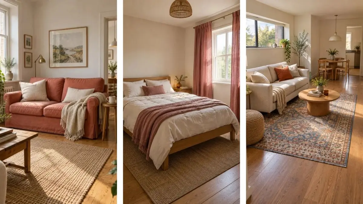
Your room may be short on floor space, but it still has room for color. The tricky part is adding it without filling every corner with another cushion, basket, or little thing that needs dusting. In a small home, even a lovely new chair can become the thing you squeeze past every morning.
The most useful colorful small space decor starts with what you already need. A sofa cover, a curtain, or a hardworking rug can carry plenty of color without taking up extra room. You can keep the layout that works and change how the space feels around it.
These ideas focus on everyday rooms, with places to put your feet, set down a mug, and open a cupboard. There are soft swaps for rooms you cannot paint, plus bolder projects for doors, shelves, and walls. Start with the spot that feels a little flat, then choose a color you would enjoy seeing on an ordinary Tuesday. One thoughtful change is enough to get going.
1. Give Your Existing Sofa a Colorful Slipcover
A beige sofa can make a small living room feel quieter than you want. Before replacing a piece that fits, check whether its shape works with a slipcover. A dusty coral, leaf green, or warm blue cover gives that same seat a fresh role.
Choose a fabric with visible texture, and keep the cushions simple. The sofa already carries most of the color, so it does not need a crowd of patterned pillows.
Before you buy: Measure the arms, back, and seat depth against the cover’s size guide. A loose cover that slides whenever you stand up will soon become annoying.
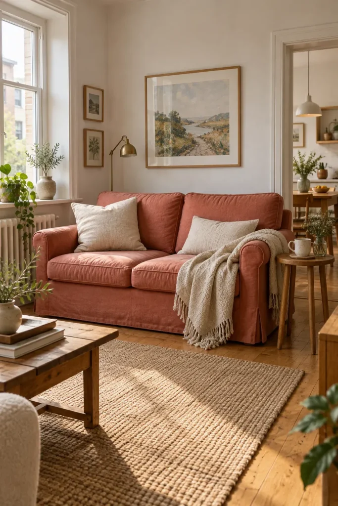
🎨 Pick a sofa color trio
Warm and soft
Sofa: dusty coral
Cushion: cream
Throw: oatmeal
Fresh and earthy
Sofa: leaf green
Cushion: pale pink
Throw: warm ivory
Bright and balanced
Sofa: warm blue
Cushion: butter yellow
Throw: soft cream
2. Frame a Small Window With Colorful Curtains
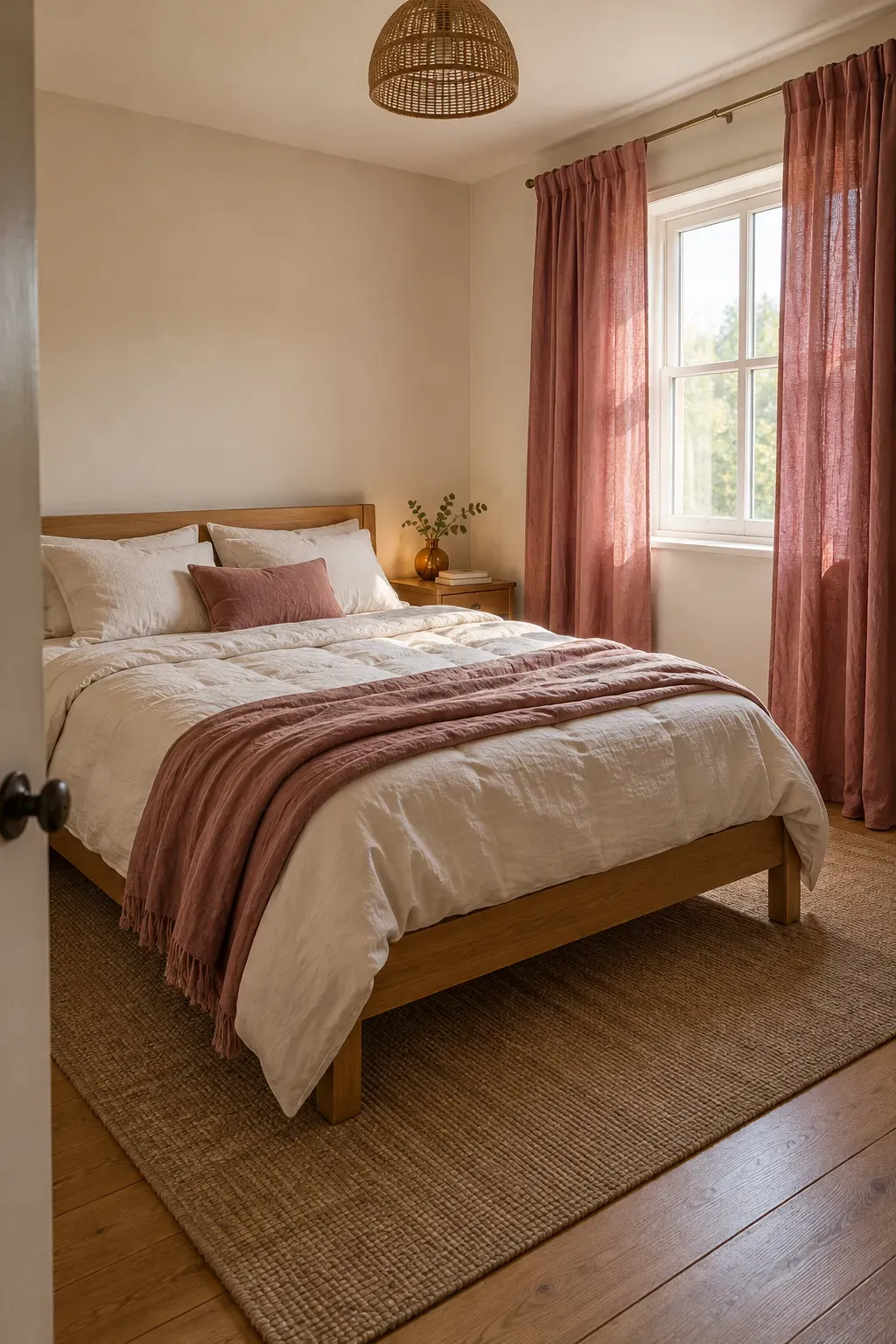
Curtains give you a generous stretch of color without taking over a shelf or side table. In a small bedroom, faded raspberry or golden yellow fabric can become the detail you notice first.
Start with a color that already appears in your bedding or artwork. A solid curtain is easy to pair with patterned pieces, while a broad stripe brings more movement to a plain room.
Keep the window useful: Make sure the panels can draw back far enough to let in daylight. Check the fabric in front of the window, too. Its color may look quite different with light shining through it.
💡 Choose a practical curtain length
For a clear wall below the window, let the hem sit just above the floor. Where furniture or a heater sits underneath, choose a suitable shorter treatment and follow the heater’s clearance guidance. Skip fabric puddles in a busy walkway.
3. Define Your Sitting Area With a Patterned Rug
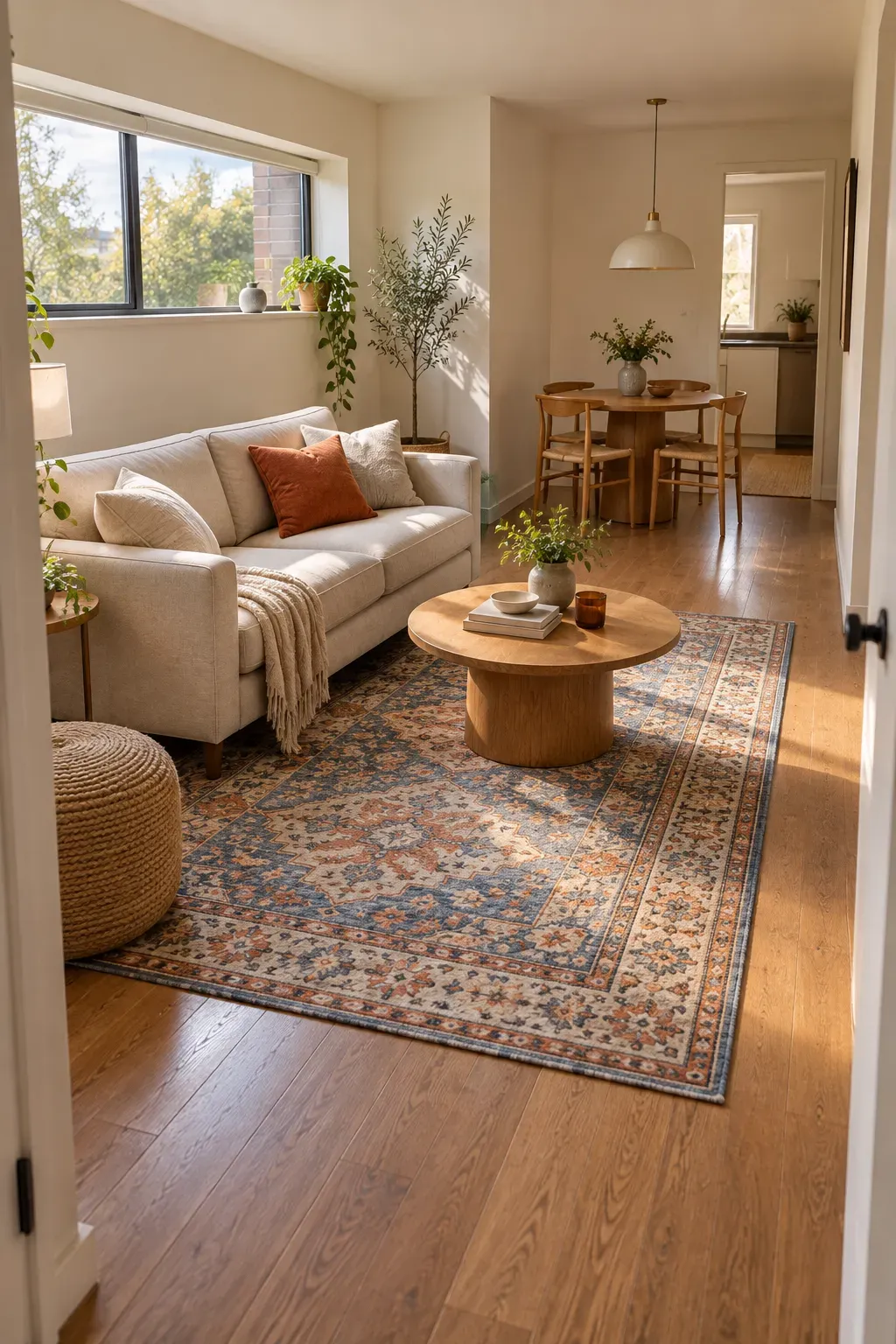
Lay a patterned rug where your seating gathers, and that corner gets a clear center. This is especially helpful when the sofa shares a room with a dining table or desk.
Look for a pattern that includes both a lively shade and a quieter background. A blue-and-rust design with cream woven through it leaves room for plain furniture. Let one rug color appear elsewhere, perhaps in a cushion cover you already own.
Check the footprint first: Mark the rug’s outline on the floor before choosing a size. Open nearby doors and walk your usual route with the outline in place.
✅ Connect the seating
Where the layout allows, rest the sofa’s front legs on the rug so the pieces feel grouped.
Choose a suitable rug pad for your flooring and keep the edges flat.
🚫 Skip awkward placement
Avoid a tiny rug stranded beneath only the coffee table.
Do not force a thick rug into a doorway where the door catches its edge.
4. Paint an Interior Door a Cheerful Shade
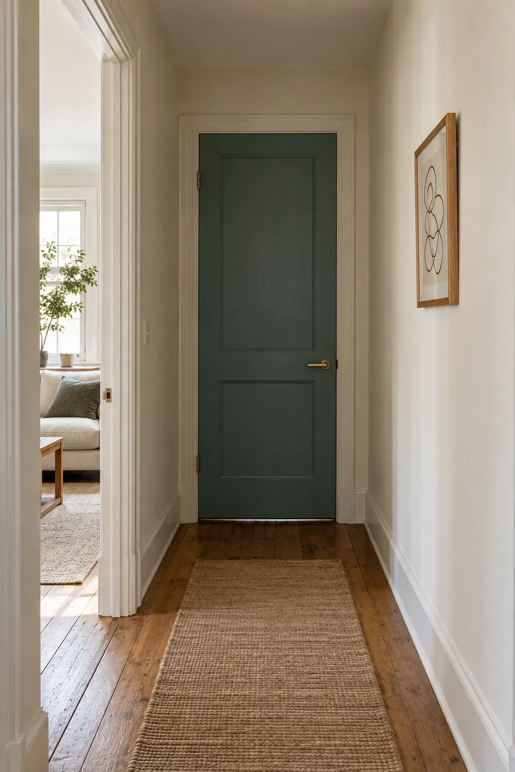
The door at the end of a short hall is already a focal point. Painting it a cheerful shade gives that view some character without adding a console table you have to edge around.
Consider a muted teal, warm peach, or soft ochre beside off-white walls. Painting just the door keeps the project contained. Leave the trim in its existing neutral shade if you want a clear frame around the color.
Try the view both ways: Check your sample with the door open and closed. A bedroom door may sit beside different wall colors depending on how you leave it during the day.
📋 Before opening the paint tin
- Check permission if you rent, including any requirement to restore the original finish.
- View a color sample beside the floor and trim in daylight and evening light.
- Identify the door’s surface and existing finish before choosing paint and primer.
- Follow the coating instructions for preparation, ventilation, and drying before closing the door.
5. Turn a Plain Bookcase Into a Colorful Focal Point
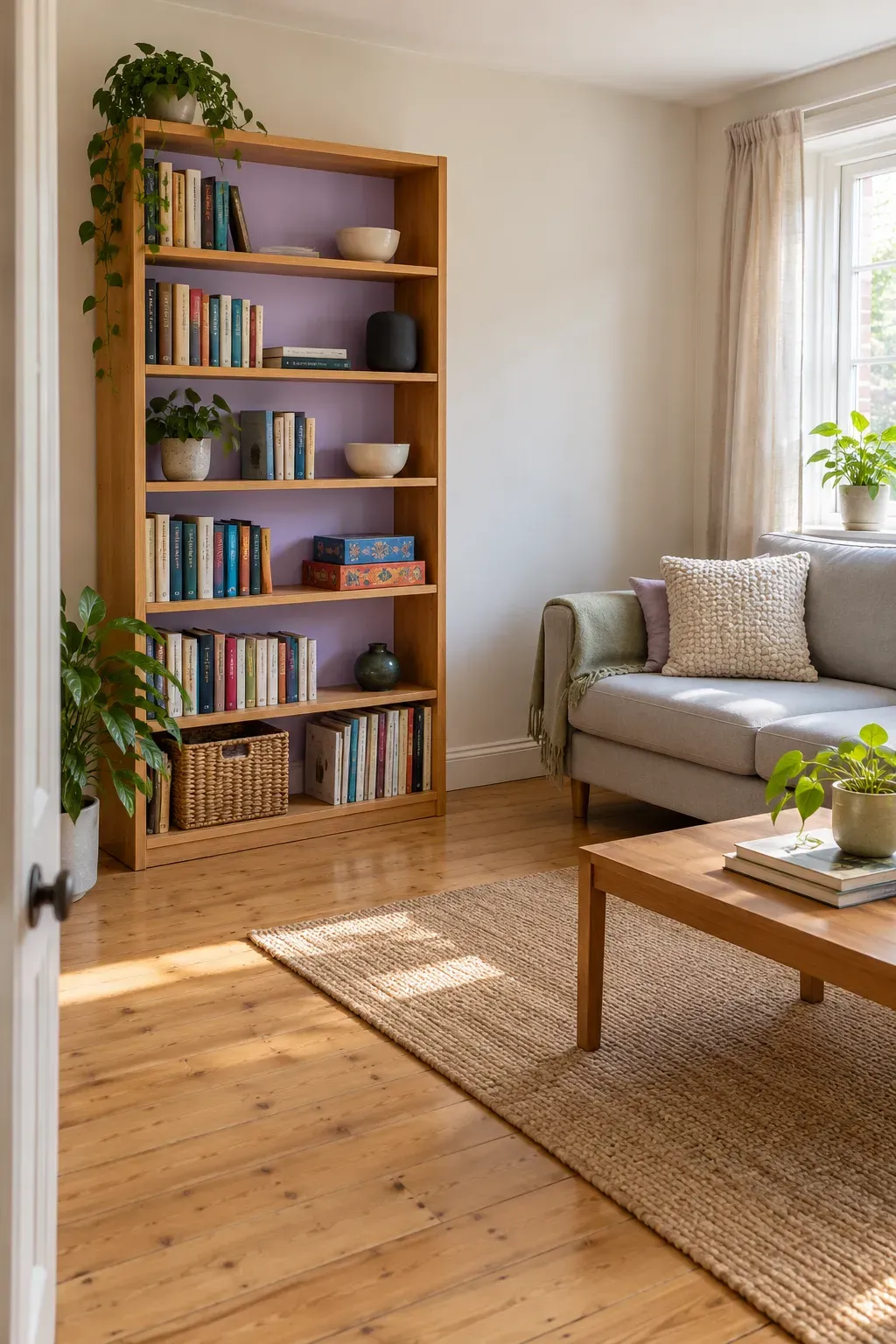
You do not need to empty a bookcase of useful things to make it look good. A colored back panel can sit behind the books, board games, and little speaker that already belong there.
Soft lilac works nicely with warm wood, while moss green gives pale shelves more depth. Keep the shelf fronts neutral so the color appears in small patches between your things.
Start with the backing: If the unit has a removable back, check how it is attached before taking anything apart. Paint only surfaces suited to your chosen finish, and let them dry fully before returning the books.
BEFORE: EVERYTHING IN A ROW
Books and boxes cover the backing edge to edge. Small items sit in front, where they must be moved to reach anything.
AFTER: COLOR WITH ROOM TO REACH
Group books by use, place heavier items lower down, and leave a few gaps that reveal the painted back. Keep daily items near the front without blocking the books.
6. Brighten a Tiny Dining Nook With Painted Chairs
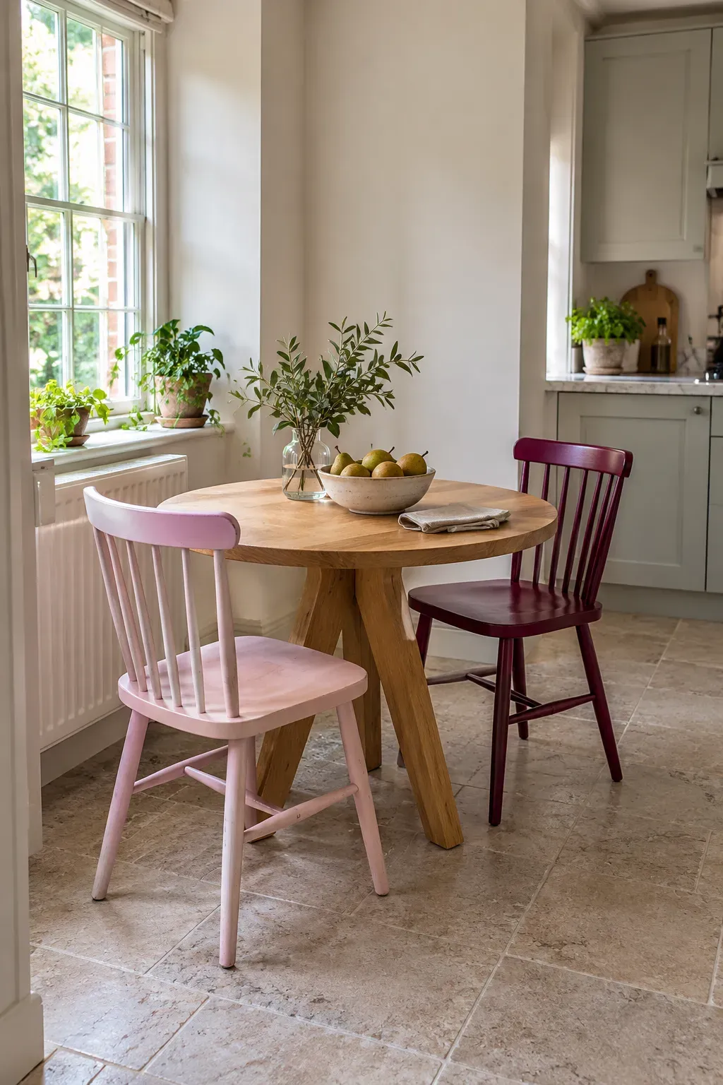
Colorful chairs can give a small dining corner a cheerful center without adding anything to the floor plan. Keep the table in its natural wood finish, then bring color to the seats around it.
For a calm look, paint the chairs the same shade of blue or green. For something more playful, pair pale pink with burgundy. Repeating the chair shape helps different colors feel connected.
Keep comfort first: Use chairs that tuck beneath the table and leave space for your knees. A pretty chair that sticks into the walkway will quickly lose its charm.
| One shared color | Different colors |
|---|---|
| Helps chairs with different shapes look like a set. | Works well when the chairs share a similar shape. |
| Useful beside patterned curtains or a busy rug. | Let a plain tabletop and simple seat pads balance the mix. |
7. Frame One Oversized Print Above Your Sofa
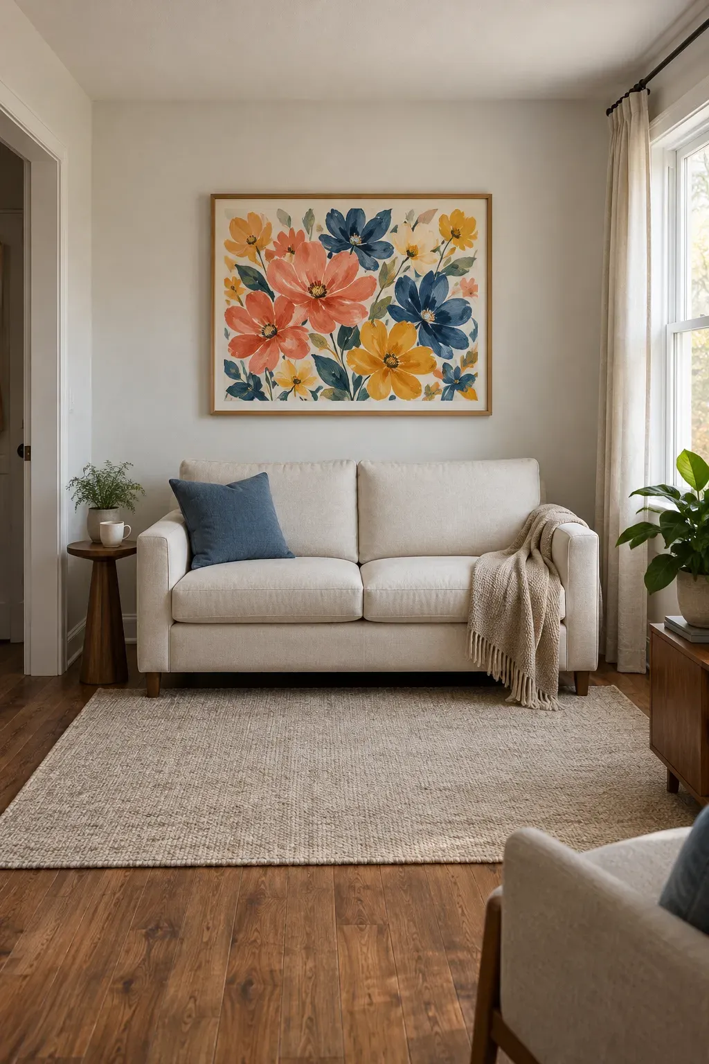
A single generous print gives your eye somewhere to land without covering the wall in small frames. Choose artwork with colors you enjoy, such as a loose floral painting, a sunny landscape, or bold abstract shapes.
Keep the frame simple so the artwork carries the color. Warm oak sits comfortably beside woven fabrics and off-white walls. You do not need to match every shade in the print to something in the room.
Test it before hanging: Tape up a paper outline, then sit on the sofa. Check that the frame will clear your head and feel connected to the seat below.
🖼️ Check the artwork against the sofa
Width
Start with a frame narrower than the sofa, leaving visible wall at both ends.
Position
Center the print over the sofa rather than the entire wall when the seat sits off to one side.
Room view
Check the paper outline from the doorway. The artwork and sofa should read as a group.
8. Give Your Bed a Bold Quilt and Simple Sheets
A raspberry quilt against cream sheets can carry most of the color in a tiny bedroom. Since the bed already fills much of the room, changing its top layer makes a clear difference without adding furniture.
Choose a quilt with a pattern you can enjoy close up, such as broad checks or loose flowers. Then keep the sheets and pillowcases simple. You can skip extra cushions if they only end up on the floor at bedtime.
Use what you own: Pull a quiet color from the quilt for your existing sheets. They do not have to be an exact match.
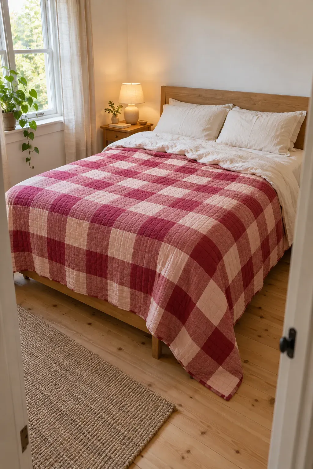
🛏️ Easy bedding combinations
- Raspberry checks: cream sheets and a warm wood headboard.
- Blue floral quilt: pale blue sheets and plain white pillowcases.
- Golden yellow stripes: ivory sheets and a soft oatmeal blanket.
9. Make a Storage Ottoman Your Main Color Accent
The throw on the armchair needs somewhere to go when you sit down. A storage ottoman gives it a home and brings color to a spot that may already hold a footstool or coffee table.
Choose a shade with some depth, such as olive green, peacock blue, or rusty orange. A textured weave can soften the look beside a plain sofa.
Measure the open lid, too: The ottoman needs enough room to open without hitting nearby furniture. If you want it to serve as an extra seat, check that the piece is designed for sitting before you buy it.
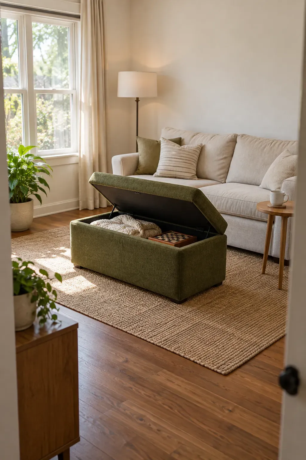
Choose the ottoman for its daily job
🪑 Extra seat
Look for a firm top and a seat height that works beside your existing chairs.
🧺 Blanket storage
Check the inside dimensions against the folded items you actually want to store.
🧵 Everyday fabric
Read the care label. Choose a texture and cleaning method that suit your household.
10. Swap a Plain Lampshade for a Colorful One
A butter-yellow shade can warm up the look of a desk corner even when the lamp is switched off. Changing the shade lets a useful object carry the color, leaving the rest of that small surface free.
Keep the base you already like and look for a compatible shade in a solid fabric or simple stripe. An opaque shade will direct light differently from a pale fabric one, so think about how you use the lamp.
Check it at night: A shade that looks lovely in daylight may tint the light more than you want for reading or working.
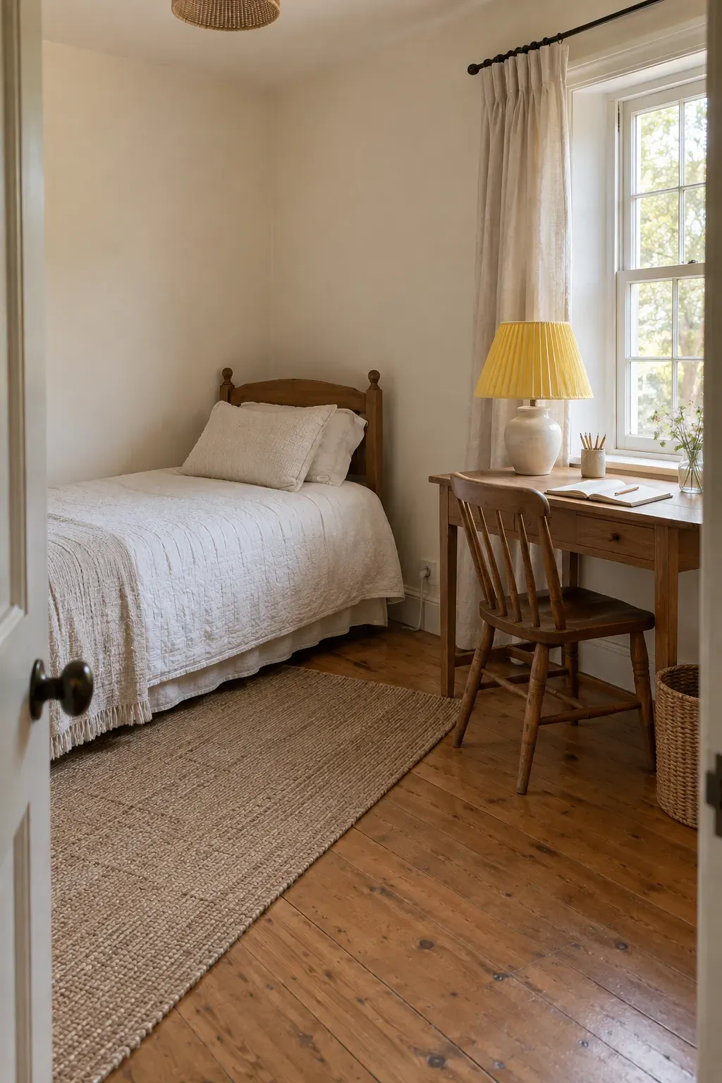
💡 Check before swapping the shade
- Match the shade’s fitting type to your lamp.
- Check that its width leaves useful space on the desk or bedside table.
- Follow the lamp and shade instructions for bulb type, wattage, and clearance.
- Test the light from your normal seated position to check for glare and comfortable reading.
11. Wrap a Small Alcove in Playful Wallpaper
A shallow alcove can handle a lively pattern without asking the whole room to join in. Wallpaper the back wall of a reading nook, recessed shelf, or little desk area to give that spot its own character.
Choose a print with a background color that sits comfortably beside the surrounding walls. Blue flowers on cream or soft green checks can bring movement to an otherwise plain corner.
Test a sample first: Look at the pattern behind the furniture that will stay there. If you rent, check permission before applying wallpaper. A removable label does not guarantee that your wall finish will stay untouched.
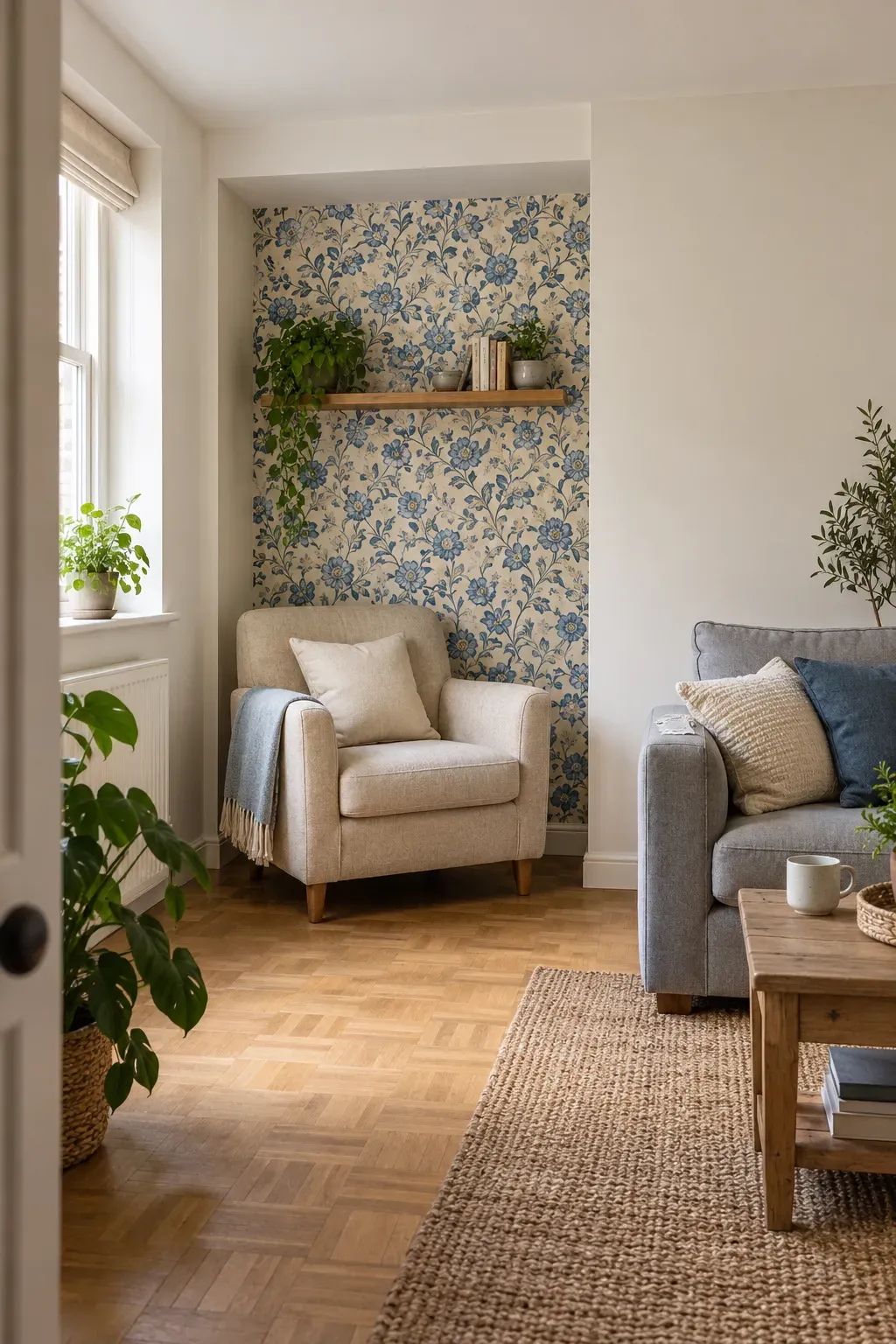
✅ Give the pattern clear edges
Use the alcove’s inside corners as natural stopping points.
Plan the pattern placement before cutting, especially when a large flower or shape will sit in the center.
🚫 Skip awkward shortcuts
Avoid ending the paper midway across a flat wall without a planned border.
Do not assume textured or freshly painted walls suit every wallpaper. Check the product’s surface requirements.
12. Paint the Ceiling Above a Compact Bedroom
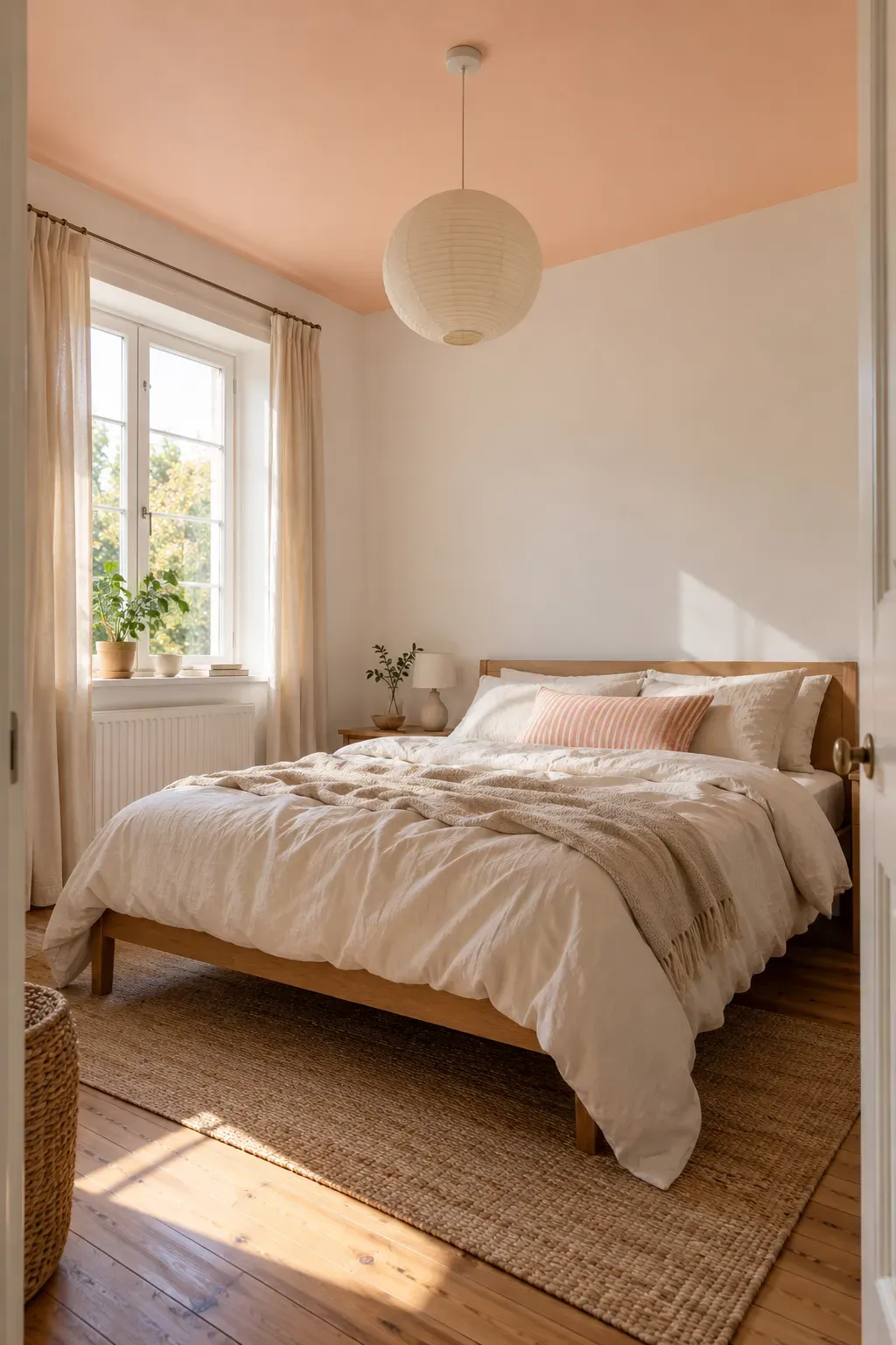
Look up from your pillow. That plain ceiling is a surface you can color without finding room for another decorative piece. Pale peach, soft blue, or a gentle yellow can make a small bedroom feel more personal.
Keep the walls quiet if you want the ceiling to be the main feature. Repeat its shade in one detail, such as a quilt pattern, so the choice feels connected to the room below.
Choose the mood you want: A deeper shade may feel snug and enclosed. A pale shade gives a softer effect. Neither needs to make the room look taller to be worth choosing.
💡 Test the color overhead
A sample viewed upright on a wall can look different overhead. Check your chosen shade on the ceiling itself before committing, then view it in daylight and with your bedside lights on. Notice how it looks beside the wall color, too.
13. Make Everyday Kitchen Dishes Part of the Decor
The bowls you reach for each morning can do some decorating between meals. If your kitchen already has an open shelf, use it for colorful dishes instead of buying objects that only sit there.
Start with a small group you use often. Blue bowls, green mugs, or a warm yellow serving dish can brighten plain cabinets. Leave enough space to lift each piece without moving a stack beside it.
Keep it within reach: Put everyday dishes where you can comfortably grab them. Save the highest shelf for lighter, less-used items, and keep everything within the shelf’s stated load limit.
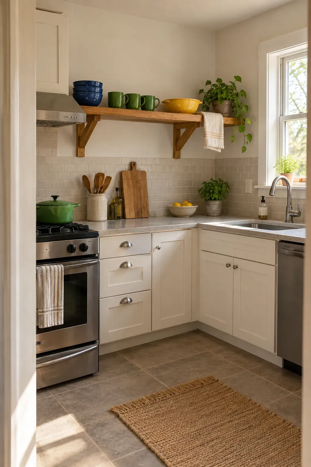
BEFORE: DECOR BLOCKS THE DISHES
Small ornaments fill the front of the shelf. Cups sit behind them, so making tea means moving several things.
AFTER: DAILY DISHES LEAD
Group mugs near the kettle and keep bowls in a short, easy-to-lift stack. Let their colors decorate the shelf, with open space around the handles.
14. Refresh a Small Bathroom With a Patterned Shower Curtain
A shower curtain gives you a broad canvas for color in a bathroom with very little spare wall. A leafy print, loose stripe, or cheerful check can change the view without taking over the sink ledge.
Choose a pattern that includes a shade already in the room, even if that shade is simply white. Then pick plain towels that sit comfortably beside it. You can keep the bath mat you own if its color still works.
Check the fit: Measure for the curtain’s width and length, and use a suitable liner if the fabric needs one. Keep the hem off the bathroom floor.
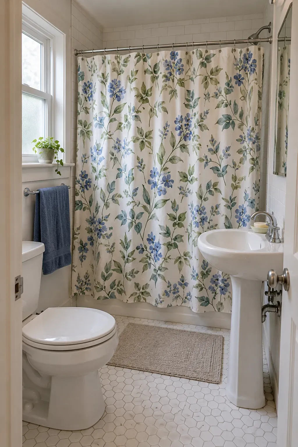
| Large motifs | Small repeating patterns |
|---|---|
| Give the eye a few clear shapes to follow, especially against plain tile. | Can read like a textured surface when viewed from the doorway. |
| Check that you still like the design when folds hide part of a flower or leaf. | Try lower contrast if the floor or wall tile already has a busy pattern. |
15. Bring Color to an Entry With a Peg Rail
The bag dropped beside the door is a good clue that your entry needs a place to hang things. A painted peg rail gives that daily clutter a home while adding a strip of color to the wall.
Try a deep blue rail against cream paint or a warm red beside pale wood. Keep the display useful, with the tote, jacket, or scarf you actually reach for.
Check the loaded depth: Hanging bags stick out farther than empty pegs. Choose a spot where they will not block the door, catch your shoulder, or narrow the route through your home.
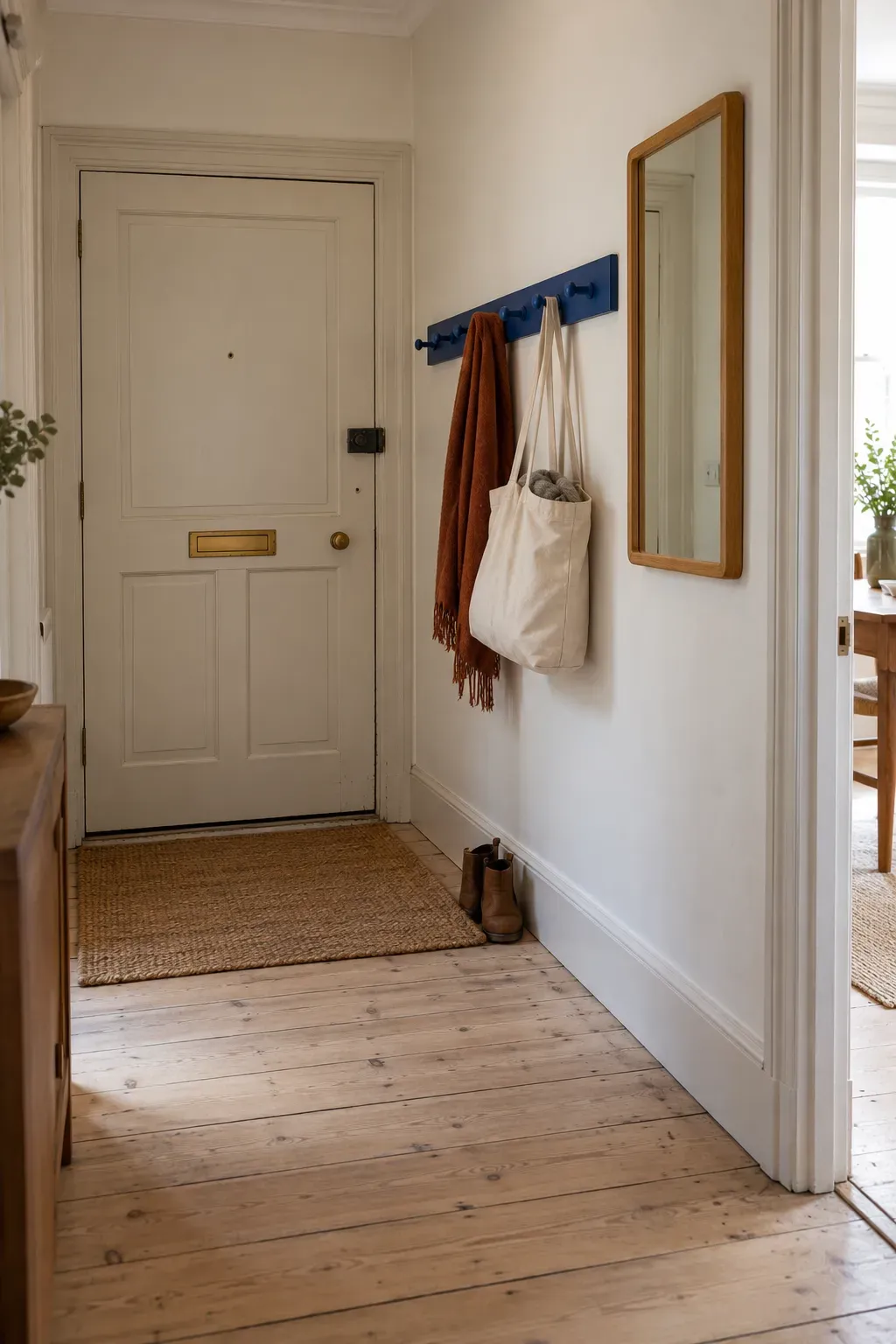
Give each peg a useful job
👜 Daily bag
Allow enough space below the peg for the bag to hang without resting on the floor.
🧣 Light layers
Keep the current scarf or jacket here. Move out-of-season layers to your main storage.
🪝 Spare hook
Leave a peg open for a visitor’s coat instead of filling every spot with decoration.
Use fixings suited to your wall and follow the rail’s installation and load guidance.
16. Group Colorful Plant Pots on an Existing Windowsill
A sunny windowsill can carry color without a plant stand taking up the corner. Use pots in a small family of shades, such as peach, terracotta, and pale yellow, to make the plants you already own feel like a group.
Vary the pot shapes a little, but keep each base fully supported by the sill. Leave room to open the window and move the curtains without catching a leaf.
Let the plants lead: Match the spot to each plant’s light needs. A pretty arrangement is easier to enjoy when you can lift every pot out for watering.
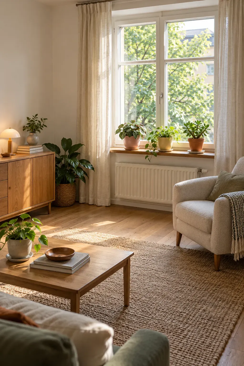
🌿 Check your windowsill setup
- Check the window’s light and temperature against each plant’s needs.
- Choose pots that sit fully on the sill without overhanging its edge.
- Use waterproof saucers or outer pots to protect the surface, and empty collected water.
- Leave the window latch, curtain path, and any required exit access clear.
17. Paint a Wall Panel Behind Your Small Desk
Give a desk tucked into your living room a clear place of its own with a painted rectangle behind it. The color marks out the work area without a screen, extra shelving, or another piece of furniture.
Try muted blue beside warm oak, or soft apricot with a cream desk. Keep the panel’s edges simple and let the desktop stay useful. The painted area can be the main decoration.
Plan around your real setup: Mark the outline before painting, then put your monitor and lamp in place. Check that enough color remains visible above and beside them to make the project worthwhile.
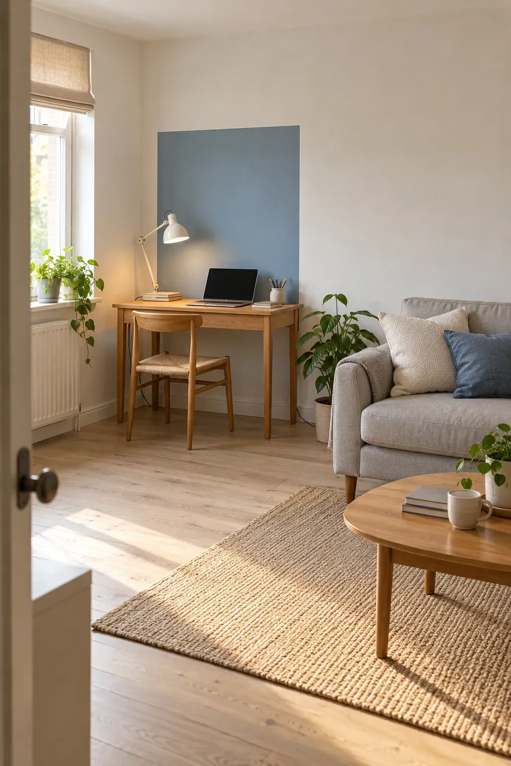
🎨 Place the panel around your workspace
Side edges
Start slightly beyond the desk’s sides. Step back and check the balance before settling on the width.
Top edge
Leave visible color above your screen. Avoid a top edge that barely touches the monitor or lamp.
Room view
Check the outline from your sofa or doorway. Keep some plain wall around it so the desk area has a clear boundary.
You do not need to try all 17 ideas to make your room feel more like you. Start with one surface you see every day, whether that is your bed, a plain door, or the wall behind your desk. Choose a color you enjoy, then live with that change before adding more.
The most useful colorful small space decor leaves room for everyday life. Your curtains should open easily, your chair should tuck in, and your favorite mug should still have somewhere to land.
Save this list to your Pinterest board for the next time your small space needs a refresh.